


What if shoppers decide your store feels sketchy before they even read a headline? In less than a blink, your design, branding, and checkout cues can either build confidence or send visitors straight to the back button. If you want more people to stay, browse, and buy, your site has to earn trust almost instantly.
Key Takeaways
- Use consistent branding, readable typography, and thoughtful color choices so shoppers can quickly recognize your business and feel confident browsing.
- Human signals like team photos, clear contact details, and visible policies help reassure visitors that a real business stands behind the store.
- Reduce friction in high-consideration moments by making checkout simple, transparent, and supported with clear security, shipping, and return information.
- Strengthen first impressions with social proof, familiar design patterns, and respectful messaging instead of intrusive popups or autoplay distractions.
How many times have you shopped online and caught yourself thinking something like:
- Wait a minute, that can’t be true. [X out of window.]
- There’s no way this shady site is getting my credit card info. Nice try. [X.]
- This is suspiciously cheap. I bet it’ll break the first time I use it. [X.]
If I had to guess, it’d probably be more times than you can count.
Whether the reaction is conscious or subconscious, you size up every single website you visit based on how trustworthy it looks.
- You want to know you’re not wasting time on false information.
- You want to avoid bogus advice or phishing attempts.
- You want confidence that the product and checkout experience are legitimate.

Image via Pinterest
What’s even more important is that Google-cited research found users form an initial gut feeling about a website in less than 50 milliseconds, with aesthetic judgments observed between 17 and 50 milliseconds. That’s the amount of time it takes a Lamborghini Aventador to change gears. Things just got serious.
So, how can you use that precious fraction of a second to get customers to take you seriously?
Quick takeaway: Trust builds fastest when your site combines clear branding, human signals, familiar user experience patterns, and low-friction checkout cues. Shoppers should be able to recognize who you are, what you sell, and how to buy safely within seconds. Small details like visible policies, reviews, and contact information can reinforce that first impression.
First Things First: Check Your Branding
You can put thousands of dollars into building a polished, highly usable website. But if your branding is off, your site starts at a disadvantage before visitors engage with it. All it takes is a weird Microsoft Word word art logo, or an eye-aching color clash, for the visitor to knock your website—and your credibility as a business—down a peg.
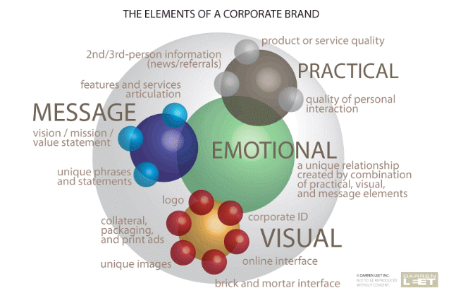
Image via Darren Leet Incorporated
In addition to things like:
- a captivating hero
- intuitive navigation
- consistent logo use
- readable typography
- cohesive colors and visual assets
You’ll need to examine these deeper brand elements to create a strong, credible experience.
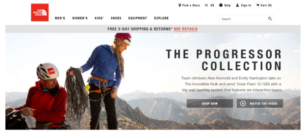
Take a look at The North Face. They’ve built a timeless brand that stands for quality in the eyes of customers. The logo is simple, recognizable, and memorable. Their website is clean and functional, giving you the key options you need right when you land. They build a connection with the user by allowing visitors to put themselves in the shoes—or hiking boots—of the adventurous outdoors lovers in their hero.
Your Logo Is Your Identity
A logo can be a complex and powerful beast. Nielsen Norman Group notes that logo placement and consistent branding help users orient themselves and reinforce brand recognition.
Remember to ask yourself:
- Does my logo truly represent my brand?
- Can people connect with it?
- Is it functional, clean, and crisp?
- Is it simple enough to still be identifiable in a small size?
- Does it still look good in black and white?
- Will it still be relevant when news or trends fade away?
For a timeless ecommerce classic, Amazon is a strong example. After checking off the basics above, the logo also leaves room for a few widely recognized visual interpretations.
At first glance, the arrow can suggest movement toward delivery. It can also read as a smile, and the arrow running from A to Z can suggest breadth of selection.

Take a look at some other logos: crisp images with clean lines and no excess. Once you start messing with gradients, bevels, and a full color palette, you’re opening the door to distracting from your message and over-complicating your presence.
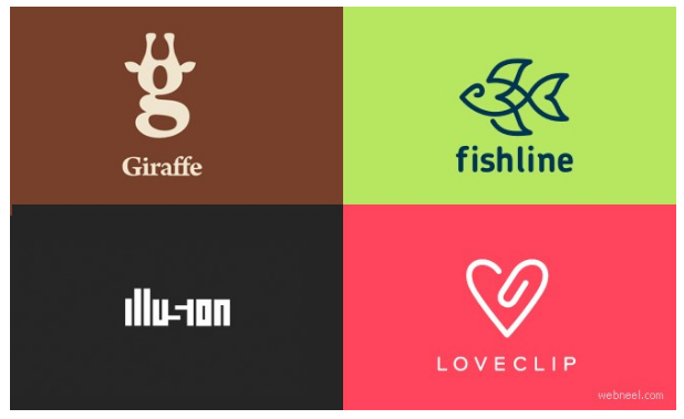
Image via Webguru
If you’re unsure of how impactful your logo is, get feedback from people you trust. If you’re still uncertain, invest in a graphic designer to do some mockups, and compare your original and the new one.
Don’t skimp on logo design. A strong logo can improve recognition and make your brand look more credible. If you think hiring a professional is expensive, just wait till you hire an amateur…
Think of a Font as a Voice
If your web copy is the message you’re giving readers, your font is a visual representation of your voice. Nielsen Norman Group’s guidance on website readability notes that typography choices affect how easily people can read and use digital content.
Are you trying to inspire and empower them? Bold, sans-serif fonts with carefully used caps can draw attention when used sparingly. Consistent typography can also reinforce brand recognition across pages and campaigns.
But when you’re using caps, be careful. This can backfire if users feel like you’re just yelling at them.
One more thing: you’re all adults here—you can ditch the Comic Sans.
Unless, of course, for one reason or another you have a specific business plan based around it. Then it’s fair game.
The Psychology of Color
Colors are more powerful than you might think. There’s a huge, comprehensive, and extremely interesting collection of research about the psychology of color and how it can be applied to marketing and branding.
- Red is often used to signal energy, urgency, or excitement.
- Blue is often associated with trust or stability in branding.
- Purple can suggest creativity or premium positioning in some contexts.
Of course, the exact impact varies from user to user, group to group—for example, different audience segments may respond differently to color—and culture to culture. Color associations are directional, not universal, so test them with your audience before treating them as rules.
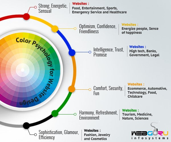
Image via Webguru
Once your visual identity is solid, the next trust layer is proving there are real people behind the store.
Humans Run Businesses – So Prove It
Another integral element is to show some personality and transparency. Somewhere along the line, it became okay to bring a sort of robotic, mechanical aspect to business. Many brands still treat online transactions as impersonal exchanges instead of relationship-building moments.
In a cutthroat digital world with millions of alternatives, that’s not effective anymore. Ecommerce shopping carts are the new cashier clerk. Your website needs to speak to your customer’s humanity; to show them you’re real, you’re listening, and you are to be trusted.
Show the People Behind the Brand
A great way to do this is to feature photos of yourself and your team members. If you don’t want to take this route, consider using lifestyle photos of people using your product. Be wary of cheesy stock photography that can actually have the opposite of its intended impact and dehumanize your brand. Here’s a current list of stock photo websites.
Beyond photos, trust also grows when you make practical information easy to find. Add visible contact information, clear shipping and return policies, and accessible customer support options such as live chat, email, or a help center. These details reassure shoppers that there’s a real business behind the screen and that help is available if something goes wrong.
That same principle applies behind the scenes, too: Nguyen Coffee Supply built supplier trust by starting with one organic product and only committing to volumes they knew they could reliably buy, rather than overpromising early. The lesson for merchants is simple—trust grows when your promises are specific, realistic, and consistently kept.
— Sahra Nguyen, Founder at Nguyen Coffee Supply (Source)
That's why we decided that, you know, let's just skip over to our end goal, which is actually organic. We're launching our first organic product and we're just going to do one because we don't want to overpromise and convert the whole entire line and then if something happens we don't want to like ruin the trust with these farmers.
For the ultimate lesson on humanizing your brand, see the magic that is Old Spice.
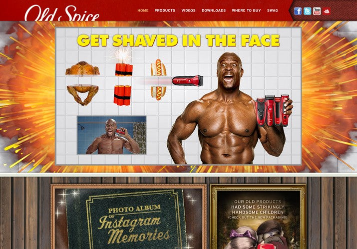
They’ve made quite a name for themselves in trekking territory that most brands won’t touch with a 10-foot pole, and that’s the all-important sense of humor.
It’s important to treat humor as a strategic choice, not a universal best practice. The American Psychological Association discusses how humor can improve attention and connection in some contexts while also creating risks if it distracts from the message. When you have the type of product or service that shouldn’t take itself too seriously in the first place, it can help build relationships and trust.
And let’s face it—toiletries are near the top of the list of products that shouldn’t take themselves too seriously.

Keep it Familiar
Familiarity can support trust. Amid your revolutionary ideas, make sure that your website still incorporates tried-and-true elements that feel familiar. They’ll also help ensure that your user doesn’t feel confused or alienated.
Here are some very basic elements that help breed a sense of familiarity but still leave some room for creativity:
- Logo on the homepage, but not necessarily in the top left corner. Keep in mind, however, that users often scan from the top and left areas of page content according to F-pattern research.
- A user-friendly navigation menu for a concise showcase of what your website has to offer.
- A concise call-to-action that paves the way for what role you’ll play in the user’s life while speaking to their needs right off the bat.
- Visuals like photos and illustrations to break up the monotony of text and keep users captivated.
Just as familiarity can build confidence, intrusive interruptions can destroy it fast.
Canned Meat Isn’t the Only Kind of Spam You Should Avoid
I’m using the term “spam” loosely here, to include any kind of advertising or special messaging that bombards, deceives, or gives a user the run-around when they first land on your site.
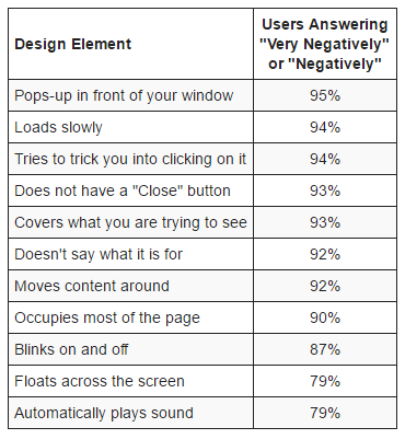
Image via Nielsen Norman Group
If you have one of those high-urgency websites that use immediate popups, callouts, or anything that blinks, please make sure you’re using these techniques responsibly and that you’re tracking your performance to make sure it’s working as intended.
Nielsen Norman Group notes that pop-ups often hurt user experience when they appear too early or block content, though some targeted uses can still be effective when they’re timed and designed carefully.
Autoplaying Audio or Videos
Generally speaking, people don’t want a loud and startling reminder that they forgot to turn their speakers down after their office dance party at 4:50 p.m. yesterday.
In addition to the rude awakening, it usually interrupts the browsing experience for your users. As you probably know, even the tiniest blip in the purchasing funnel can deter someone from making a purchase.
Here are some tips for autoplaying audio or video, if you must:
- Choose clips that are five seconds or shorter
- If it’s longer than five seconds, give the user the option to pause or stop
- Keep in mind: autoplay is more acceptable when the user is expecting it based on the link they’re clicking
After removing distractions, the next place to focus is where trust matters most: the moments closest to purchase.
Pay Special Attention to “High Consideration” Areas
How many times have you been to a website, and you’re just about to click the “Complete Purchase” button, only to get cold feet and abort the mission because you had a bad feeling? Or what about the times you added an item to your cart, but then ditched it because you got confused or frustrated when you tried to move forward?
Why checkout trust matters
The point where a customer is ready to hand over their email or bust out those sacred 16 digits is a pretty important stage in the ecommerce process. Pay special attention to this area.
Ecommerce copywriting is critical for catching your reader’s eye, piquing their interest, and gaining their trust. In these high-consideration areas, focus on timeless trust signals such as clear form labels, visible shipping and return details, accepted payment options, guest checkout, and concise reassurance around security and privacy.
Security badges can help when they’re used sparingly, but clarity and low-friction form design usually do more of the heavy lifting. Real-world results back that up: after Braun Büffel moved to Shopify Plus, page load times dropped by 66% and bounce rate fell from 55% to 42%, reinforcing how speed and simplicity can directly improve trust during the buying journey.
Seamless payment options matter here, too. In Shopify’s case study on 7B Boardshop, the team found that Shop Pay helped customers complete purchases quickly, supporting the idea that familiar, low-friction checkout experiences can make trust feel almost automatic.
— Justus Hines, Marketing Manager at 7B Boardshop (Source)
Shop Pay has been huge for us. Customers just hop on the iPad and the next thing you know, they're walking out of the door, and we've made a sale.
Reputation and Social Proof to Back it Up
Of course, few things build trust as effectively as a strong reputation and credible customer proof. So if your company is in its infancy or toddlerhood, keep in mind that the ultimate goal is to expand your brand and find your place in the industry.
On your quest to become as omnipotent as Apple or Coke, social proof matters. PowerReviews’ 2023 survey of 8,153 U.S. consumers found that nine in 10 consumers consider reviews when making a purchase decision.
Social proof can take several forms in addition to product reviews, like press mentions, expert and celebrity shout-outs, customer testimonials, user-generated content, and trust seals like accreditations and security badges. BrightLocal’s Local Consumer Review Survey also shows that reviews remain a meaningful part of how people evaluate businesses online.
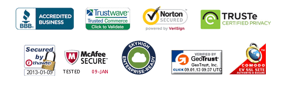
Image via HubSpot
A Case Study: Tim Ferriss website
Taking all the above considerations, let’s examine the Tim Ferriss website. This is a subjective visual analysis, not a measured conversion case study.
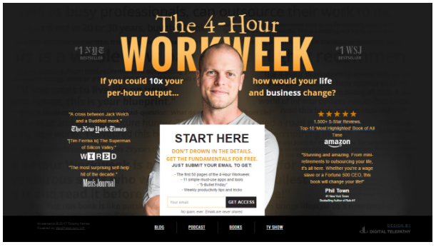
You’ll see:
- An orange/yellow palette that may convey warmth and optimism, depending on the audience.
- A friendly, welcoming, and charming photo of himself to show his human side and personality while creating a connection.
- The logo is on the larger side, but it shares space with his photo to avoid being too loud or overpowering. This balances the logo and portrait so neither dominates the page.
- Social proof from heavy-hitting companies with great things to say about him.
- An informative, actionable, and clearly defined call-to-action to collect user contact information. It even offers the first 50 pages of his book so users can “try before they buy”—a great way to build trust and confidence in your offering.
- A unique, but still familiar layout—if users don’t want to sign up just yet, they can still find a traditional navigation menu at the bottom of the screen.
Overall, the page combines personal branding, social proof, and a clear call to action.
Slow and Steady Wins the Race
Trust is easier to lose than to earn, which is why the strongest stores focus on the basics first: consistent branding, human signals, and a checkout experience that feels clear and safe. Add social proof and remove distracting friction, and you give shoppers more reasons to stay confident from first click to final purchase.
Audit your homepage, product pages, and checkout flow this week for anything that feels confusing, intrusive, or incomplete. Then use Shopify to refine your design, surface trust signals, and keep testing what helps customers feel secure enough to buy—start improving your store today.
Read more
- Marketing Calendars for 2018’s Holidays: Ecommerce, Social & Sales
- Facebook Messenger Marketing Flows You can Copy and Paste
- Designing the New Customer Experience: What Happens After Checkout?
- How to Use a What-if Analysis to Measure the Effects of Your Decisions
- Multi-Channel Software: Listing, Selling & Managing Everywhere Your Customers Buy
- What Conversion Experts Wished You Knew About Optimization
- Scaling a Global Ecommerce Business: Three Keys from $100M+ Enterprises
- Hypefest 2018: O2O Examples from the Forefront of Marketing & Retail
- 12 Checkout Process Optimization Tips to Increase Ecommerce Revenue
- Guest Checkouts: Definition, Benefits, and Best Practices
Frequently Asked Questions
What makes a website look trustworthy?
A trustworthy website usually combines clear branding, readable design, visible contact information, and familiar navigation patterns. Add reviews, transparent policies, and a clean checkout experience, so shoppers can quickly confirm your store is legitimate.
How can I build trust on my Shopify store?
Start by tightening your branding, improving product page clarity, and making shipping, returns, and support details easy to find. Then strengthen checkout with clear form labels, accepted payment options, guest checkout, and customer reviews throughout the buying journey.
Why do popups and autoplay hurt trust?
They can make your store feel pushy, distracting, or difficult to use before visitors have even explored your offer. If you use them, time them carefully, keep them easy to dismiss, and make sure they support the shopping experience instead of interrupting it.
Do I need expensive design to make my store credible?
No—credibility comes more from consistency, clarity, and usability than from flashy design. A simple, polished theme with strong branding, helpful copy, and transparent policies can build trust without a massive budget.
What are the best alternatives to trust badges?
Trust badges can help, but strong alternatives include customer reviews, clear return policies, visible support options, accurate product details, and a friction-free checkout. These signals often do more to reassure shoppers because they directly answer the questions buyers already have.

